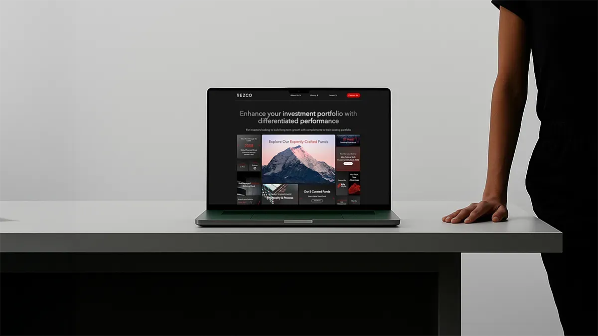
Clarity over clutter
Dense tables, small charts and blocks of text were replaced with a clean, minimalist visual hierarchy so the audience could absorb the insight instead of decoding the slide.
Home/Work/Rezco Pitch Deck

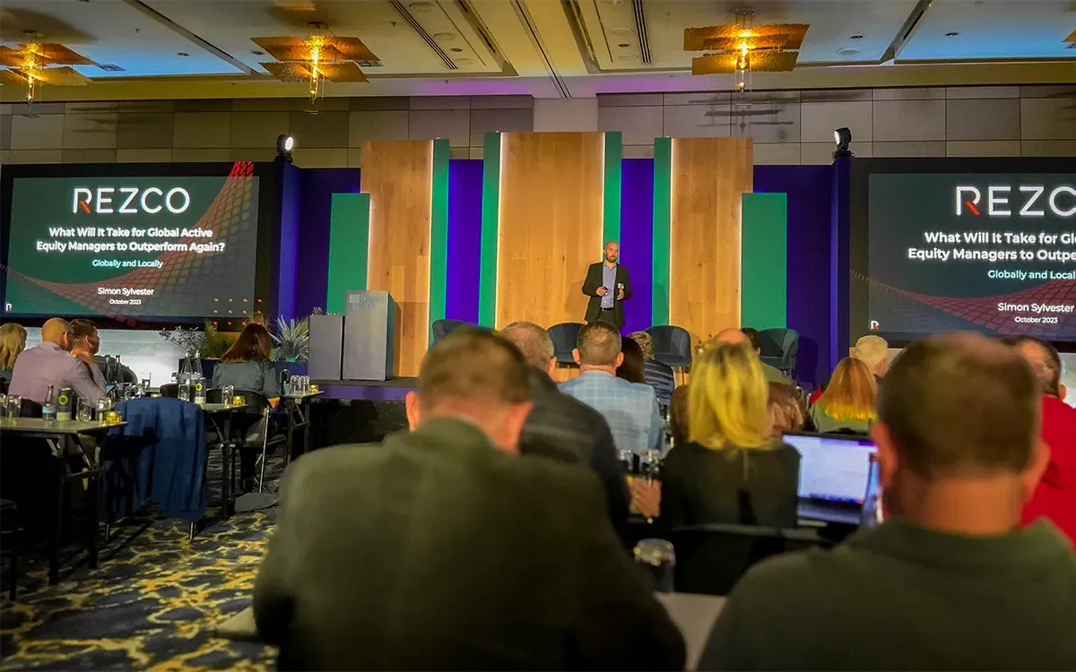
Rezco Asset Management is a seasoned investment management firm embracing technology and AI. Each quarter, Rezco delivers clear, compelling investment insights through live webinars to audiences of about 300 to 500 investors, clients, and industry peers. To sharpen these communications, Rezco partnered with Point A Marketing for a strategic redesign of its presentation decks. The goal was to align content and visuals with Rezco’s forward-looking brand and ensure clarity for its sophisticated audience.
In high-stakes communication, narrative and design are strategic forces. Research shows that information shared through narrative is up to twenty times more likely to be remembered, making storytelling a powerful way to engage investors. At the same time, design clarity is essential: overly complex or cluttered slides can overwhelm audiences and detract from the message . By combining a compelling narrative with a clear, uncluttered visual hierarchy, presenters ensure that investment insights truly shine.
Rezco’s previous decks were rich in analysis but often burdened by data. Small charts, dense tables, and blocks of text turned each slide into a puzzle for viewers. As one presentation designer notes, slides like these “overwhelm audiences with high cognitive load,” causing listeners to focus on decoding visuals rather than absorbing key insights . In effect, Rezco’s detailed content risked being lost in the clutter. We recognised the solution: a clean, minimalist aesthetic, recommended by experts, to help the audience focus on the narrative.
Rezco led with the core content. Their team brought deep insight into the market, shaping each quarterly webinar around themes that mattered, from macroeconomic shifts to investment positioning. Our role was to support that thinking by ensuring the delivery was as clear and intentional as the ideas themselves.
We focused on alignment. Each slide was carefully reviewed to ensure consistency in typography, color usage, and spacing. We refined layouts so that the visual flow echoed the story, not just from start to finish, but slide to slide. Our aim was never to reshape the message, but to let the message land more effectively.
Visually, we worked within Rezco’s existing brand system. Instead of reinventing, we clarified, removing decorative clutter, simplifying busy graphs, and creating a rhythm that allowed space for emphasis. Inspired by minimalist design principles, we made subtle choices that let each idea breathe. The result was a deck that felt cohesive, modern, and quietly confident.
Over multiple webinars, we continued to refine. After each event, we reviewed how the visuals supported the live delivery, noting moments where a chart worked, or where a layout could be improved. This slow, deliberate iteration helped the deck evolve, not dramatically, but precisely, in step with Rezco’s ongoing communication goals.
The results were immediate. In the first redesigned webinar, presenters found the new slides instantly clear – they could engage in true dialogue rather than slogging through explanations. Audience polls and feedback showed stronger understanding of Rezco’s investment story; listeners weren’t getting bogged down in slides, they were asking strategic questions about the market outlook. This outcome matches communication best practices: clear, concise visuals let people grasp ideas quickly and make the presentation more memorable .
Over several quarters, this narrative-driven approach became Rezco’s new standard. Webinars evolved from routine data dumps into cohesive story sessions. Attendees noted the polished look of the presentations, and Rezco’s team felt renewed confidence – the sharper, more intentional slides reinforced the brand’s reputation as sophisticated and forward-thinking.
Financial services teams facing a major communication milestone can count on Point A. Whether it’s a quarterly investor webcast, an earnings presentation, or a strategic pitch, we bring storytelling and design expertise to every project. Let us help you clarify your message, engage your audience, and elevate your brand. Contact Point A Marketing to make your next presentation a clear, compelling testament to your vision.
Dense tables, small charts and blocks of text were replaced with a clean, minimalist visual hierarchy so the audience could absorb the insight instead of decoding the slide.
We refined rather than reinvented: consistent typography, colour and spacing within Rezco’s existing brand system, with simplified graphs and room for emphasis.
Each quarterly deck follows the story Rezco’s team wants to tell — from macroeconomic shifts to positioning — with visual rhythm that carries the argument slide to slide.
After each live event we reviewed how the visuals supported delivery and refined the system in step with Rezco’s communication goals.
From the first redesigned webinar, presenters could hold a genuine dialogue with 300 to 500 investors instead of narrating slides, and audience questions shifted to the market outlook itself.
Over several quarters the narrative-driven format became Rezco’s default. Attendees noted the polished look, and the sharper decks reinforced the firm’s reputation as sophisticated and forward-thinking.
No pressure. No fees. Just clarity.