Branding a financial NGO, instilling trust and collaboration
/Global Asset Management Standards
Overview
Sector
Services
Technology used
Audience
Global Asset Management Standards is a non-profit initiative providing open-source templates, checklists, and compliance tools for the financial services industry. It aims to reduce duplication of effort, cut costs, and improve outcomes by sharing standardized resources across organizations. The team came to us with extensive content but no visual identity or web presence – essentially just text and a vision.
Challenge: We needed to make dense regulatory information accessible and engaging for a wide range of finance professionals across roles and regions. The solution had to instill trust and clarity without clutter or jargon. Simplicity was paramount: users should instantly grasp the value of GAM Standards and navigate the content without feeling overwhelmed.
Our Approach
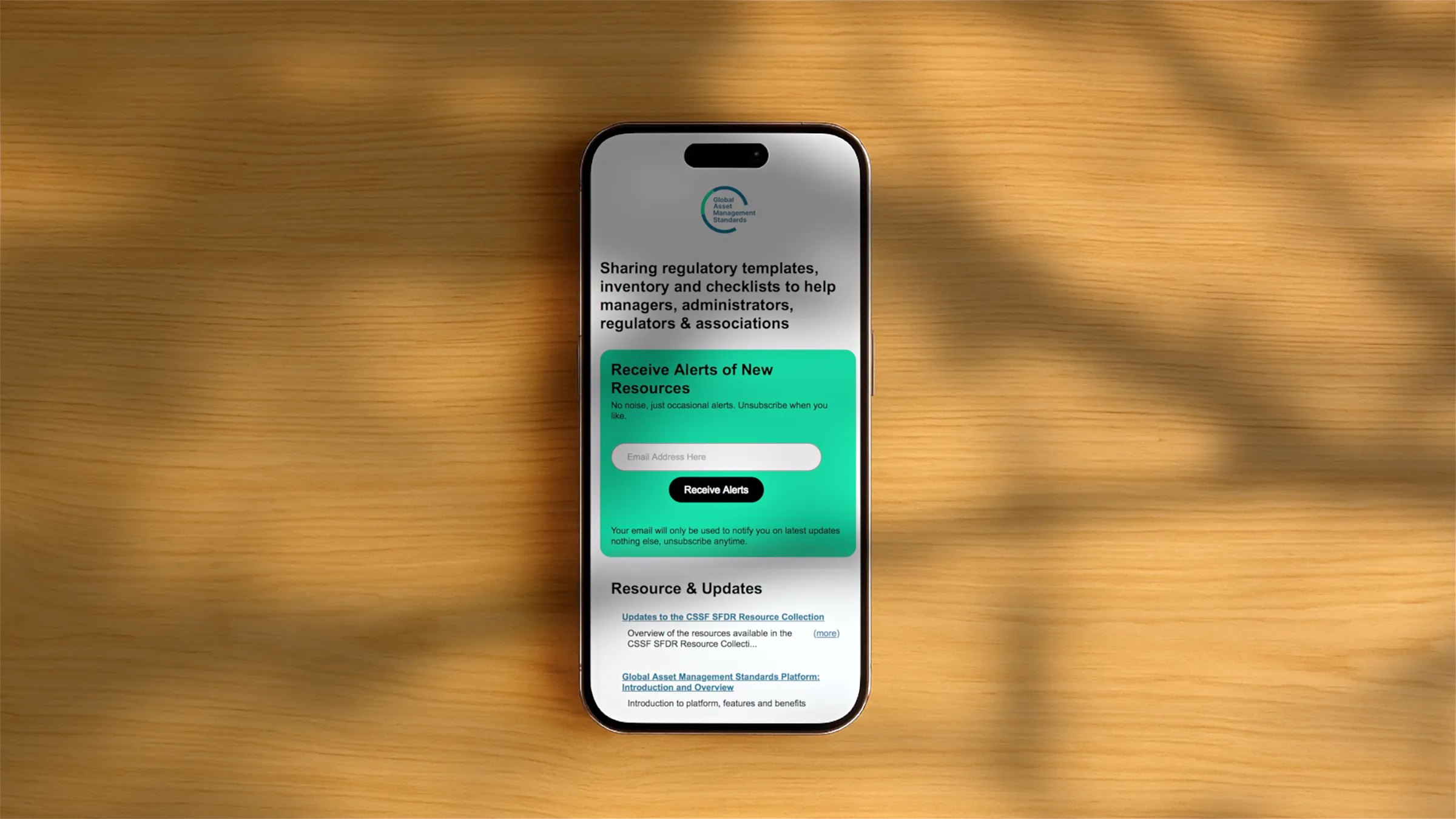
1. Establishing a Clear Identity: We began with branding. The logo we designed for GAM Standards is minimalist and meaningful – a circular form (suggesting global unity and ongoing progress) with a break that implies openness and collaboration. Paired with a clean sans-serif logotype, it immediately communicates a sense of trust. The colour palette uses cool, professional tones (inspired by financial services norms) with a fresh accent of teal to indicate innovation. Typography was chosen for legibility and modernity, reinforcing clarity in every word on the site.
2. Content Simplification: Faced with only raw text and detailed documentation, we distilled the core message of GAM Standards into an easy-to-follow narrative. We worked closely with the client to strip away jargon and highlight the why and how of the initiative in plain language. This content strategy ensures that whether a user is a compliance officer, a fund manager, or a regulator, they can quickly understand what GAM Standards offers. We organized information into digestible sections, starting with a concise value proposition, then an explanation of the solution, and finally detailed FAQs for those who want to dive deeper. Every section was written to be precise and direct, echoing Jony Ive’s philosophy that content and design should bring order to complexity.
3. User-Centred Single-Page Design: We chose a one-page website format to present everything cohesively. This decision keeps users focused on a linear story, guiding them from introduction to engagement without jumping between pages. The layout flows logically:
• First, a hero section introduces the platform with a clear tagline and an invitation to learn more.
• Next, an explainer video section provides a quick, visual summary of GAM Standards in action.
• This is followed by a key points/overview blurb reinforcing the benefits (how it saves time, cuts costs, and reduces risk through shared standards).
• A resources preview shows that free templates and checklists are available, adding credibility by demonstrating substance behind the idea.
• Then, a structured FAQ addresses common questions in an accordion style – users can click questions to reveal answers. This keeps the page uncluttered, letting readers seek details on their terms.
• Finally, a call-to-action contact section invites engagement (sign up for alerts or send a message) with minimal barriers.
Throughout the design, we applied a “less, but better” approach: plenty of white space, simple icons, and short blurbs. Visual cues guide the eye without noise. For example, we used icons and brief headings for each FAQ question, so users scan quickly. The single-page scroll is smooth and performance-optimised, so even a busy professional on a mobile device can scroll and grasp the content in moments.
Key Features
Modern Single-Page Website: All essential information lives on one clean page. This design reduces complexity. No clicking through multiple pages means the message stays cohesive and focused.
Elegant Brand Identity: A new logo and visual style give GAM Standards an immediate sense of credibility. The logo’s circular motif and the consistent colour scheme appear throughout the site, from icons to buttons. This unified look and feel conveys professionalism and trust at every touchpoint.
Explainer Video Integration: A short, engaging video is embedded near the top of the page. It delivers the value proposition in under two minutes, using friendly visuals to illustrate how shared standards benefit the industry. Placing the video prominently helps hook visitors, especially those who prefer visual learning, without forcing anyone to watch.
Structured FAQ Section: The site features an interactive FAQ that collapses and expands answers. This keeps the interface uncluttered – visitors see a list of key questions and can drill down into the answers they care about. By anticipating user questions (“Who are we?”, “Why is it free?”, etc.), we address potential doubts upfront in a digestible format.
CMS-Backed Resources & Updates: Behind the scenes, the resources section is powered by a simple Content Management System. This allows the GAM Standards team to publish new templates, checklists, or news updates easily. On the page, users see the latest update title and a prompt to view more, ensuring the site always feels current and valuable without requiring a full redesign for each new addition.
Frictionless Engagement: The design invites users to engage on their own terms. An email sign-up for alerts is offered with a gentle prompt (no intrusive pop-ups or mandatory fields). All the actual content (templates, guides, etc.) is freely accessible without any login. The contact form at the bottom is straightforward, and thanks to reCAPTCHA, genuine inquiries get through while bots are kept out. This approach lowers barriers – if someone finds value in GAM Standards, nothing on the site will slow them down from accessing materials or getting in touch.
Results
Clarity and Professionalism: The brand identity and clean site design earned immediate positive feedback. Stakeholders noted that the platform “finally looks as credible as it sounds.” The modern, consistent visuals give confidence to users that this is a serious, reliable resource in the industry.
Enhanced Understanding: Qualitative feedback from early users highlighted that it’s much easier to grasp what GAM Standards offers now. By presenting information in a concise way (and offering the explainer video and FAQs), the site succeeds in educating a diverse audience — from tech-savvy professionals to less technical executives — all within a single page. Complex regulatory concepts feel simpler when framed with plain language and clear examples.
Approachable User Experience: What was once dense text is now an inviting web experience. The structured layout and interactive elements (like the FAQ) make a heavy topic feel lighter and usable. Users have commented that exploring the site doesn’t feel like work; instead, it feels intuitive. The initiative’s broad audience finds the interface welcoming whether they’re skimming for a quick overview or digging into specifics.
Empowering a Shared Resource: The combination of open access and straightforward calls to action means more people are leveraging the GAM Standards templates and tools. By removing friction (no paywalls, minimal sign-up steps), the site aligns with the nonprofit’s mission of collaboration. Early adoption by multiple firms and associations — along with offers to contribute new templates — suggest that the design successfully fostered a sense of community and openness. In short, the project turned an abstract concept into a tangible platform that people want to use and share.