Next-generation fund administrator serving asset managers
/Agulhas Fund Services
Overview
Sector
Services
Technology used
Audience
Agulhas’s mission is to let investment teams “invest, without the noise” by removing the burdens of complex back-office management. The company’s technology automates administration, delivers advanced reporting, and provides a modern operational infrastructure for fund managers. Our challenge was to translate this sophisticated vision into a brand and website—from scratch and in under 1.5 months. We needed to establish credibility for an early-stage company, articulate a clear positioning (even as the business strategy was still being refined), and do it all within a very tight timeline.
In this overview stage, we defined Agulhas’s brand foundation and project scope. The engagement covered complete brand identity development, including naming guidance, logo design, and visual standards, as well as messaging and positioning to tell Agulhas’s story. We also undertook website design and development (from the landing page to detailed solutions pages), focusing on a seamless user experience. Despite the accelerated schedule, our approach remained thoughtful and precise, ensuring every design decision reinforced Agulhas’s values of innovation and trust.
Our Approach
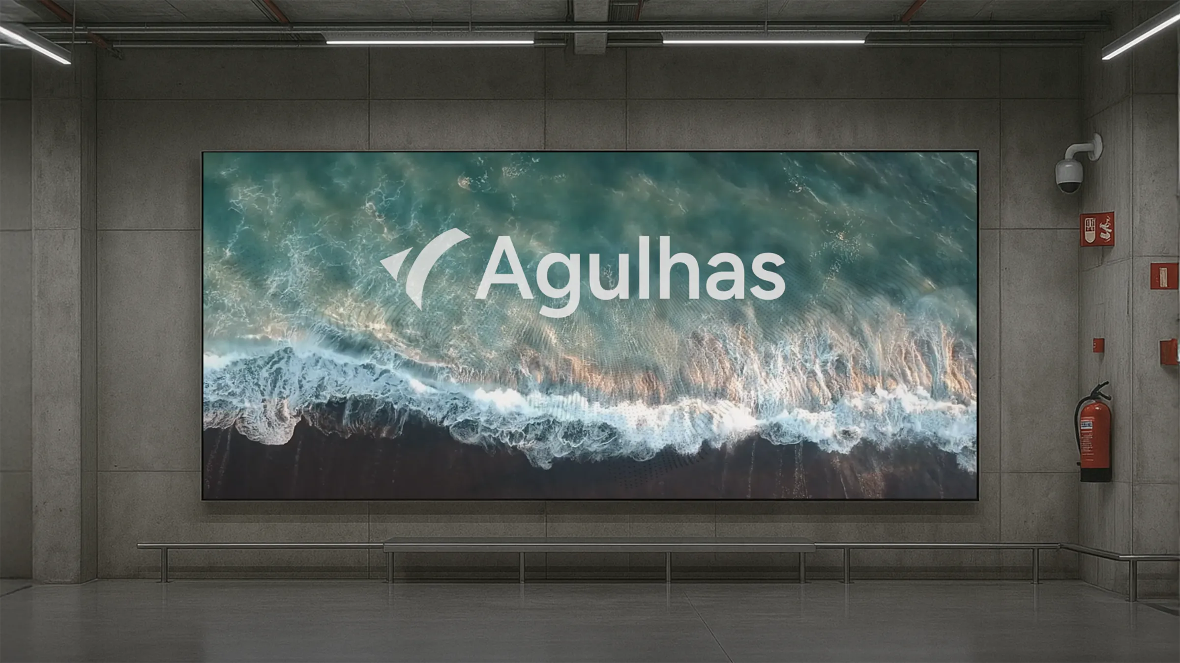
Our approach began with distilling Agulhas’s core idea: flow. We drew inspiration from the Agulhas Current, a strong ocean current that guides and circulates waters, to symbolise how Agulhas Fund Services guides financial operations. The logo mark was designed as a subtle wave-like arrow, suggesting movement and direction. We paired it with modern typography and a calm, ocean-inspired colour palette (deep navy and cool aqua tones) to invoke stability and fluidity. Every visual element was chosen to feel restrained yet confident, much like Agulhas’s promise to streamline complexity in the background.
Collaboration with the client was key. As Agulhas’s business positioning evolved during the project, we remained agile, refining messaging in tandem with design. We kept language clear and jargon-free, echoing a philosophy of simplicity—every line of copy had a purpose. For the website, we adopted a modular design system: sections are simple and focused, allowing content to breathe. We introduced interactive frosted-glass card effects in the UI, creating a subtle translucent overlay that nods to water’s surface and adds depth to the browsing experience. This frosted glass, combined with gentle animations, gave the interface a contemporary, high-tech feel without overwhelming the user. Throughout the approach, we balanced speed with precision, conducting rapid design iterations and feedback sessions to meet the deadline while upholding a high standard of quality.
Key Features
Flowing Brand Mark: A new logo inspired by the Agulhas Current, featuring a sleek arrow-like wave symbol. It conveys movement, guidance, and forward momentum, setting the tone for the brand’s identity.
Ocean-Inspired Visual Identity: We developed a cohesive visual system using an oceanic theme. The colour scheme blends deep blue tones with crisp white, evoking trust and clarity. Subtle wave motifs and diagonal elements echo the idea of currents and flow across various collateral.
Modern, Modular Website: The website was designed with simplicity and flexibility in mind. A clean layout with ample white space helps information stand out. Content is organised into digestible sections (Overview, Solutions, etc.), each in a modular block that can scale as Agulhas grows. Full-bleed imagery (like sweeping ocean visuals) provides immersive context without clutter.
Frosted-Glass UI Elements: Key interface cards and menus use a frosted-glass effect, a translucent blur that overlays background content. This touch of depth creates a polished, fintech-modern aesthetic and reinforces the water metaphor. It allows imagery to shine through subtly while keeping text legible, resulting in an interface that feels both innovative and approachable.
Refined Messaging & Tone: Every piece of copy was crafted to be precise and confident. We provided positioning guidance to ensure Agulhas’s value proposition is clear: freeing investors from operational “noise.” The tone across the site is professional yet accessible, mirroring the brand’s blend of finance expertise and tech-forward thinking. Headings are punchy (e.g., “Invest, without the noise”), and supporting text is kept concise, focusing on benefits and outcomes.
Results
The Agulhas project met an aggressive timeline with time to spare, and the outcomes have been enthusiastically received. We delivered the final brand identity and website with zero revisions required – the first design presented was the one that went live. The client described the work as “deeply resonant and truly representative” of their vision, a validation of our thoughtful, focused process.
The new website’s hero section and ocean motif have proven especially impactful. Upon launch, visitors immediately commented on the fresh look and intuitive navigation. The striking hero imagery and tagline quickly communicate Agulhas’s value, while the seamless user experience builds trust. Internally, the client noted that the brand feels “established beyond its years,” giving this startup the credibility of a seasoned player. Ultimately, the project not only produced a polished site and brand collateral, but it also helped Agulhas achieve early-stage validation – instilling confidence in investors and clients that this fund services platform is modern, reliable, and here to stay.